이 글은 Datascience from scratch와 함께 했습니다 :)
matplotlib
시각화를 위한 도구는 무궁무진하다. 그 중에서 matplotlib은 간단한 막대 그래프, 선 그래프, 산점도를 그리기에 적합하다.
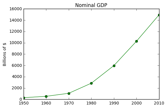
선 그래프
from matplotlib import pyplot as plt

#data
years = [1950, 1960, 1970, 1980, 1990, 2000, 2010]
gdp = [300.2, 543.3, 1075.9, 2862.5, 5979.6, 10289.7, 14958.3]

#draw
plt.plot(years, gdp, color='green', marker="o", linestyle='solid')
"""linestyle의 값을 없애면 선이 없어진다."""

#title
plt.title("Nominal GDP")

#label
plt.ylabel("Billions of $")

plt.show()
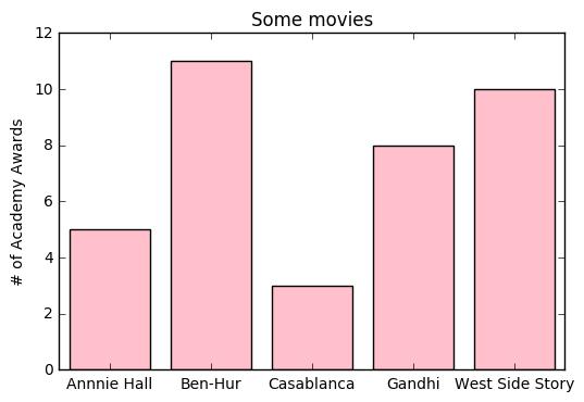
막대 그래프
from matplotlib import pyplot as plt

movies = ["Annnie Hall", "Ben-Hur", "Casablanca", "Gandhi", "West Side Story"]
num_oscars = [5, 11, 3, 8, 10]
graphx = [i + 0.1 for i, _ in enumerate(movies)]  # 각 막대의 위치를 정하자.
plt.bar(graphx, num_oscars, color='pink') # pink!
plt.title("Some movies")

#x,y 좌표의 라벨
plt.ylabel("# of Academy Awards")
plt.xticks([i + 0.5 for i, _ in enumerate(movies)],movies)

plt.show()
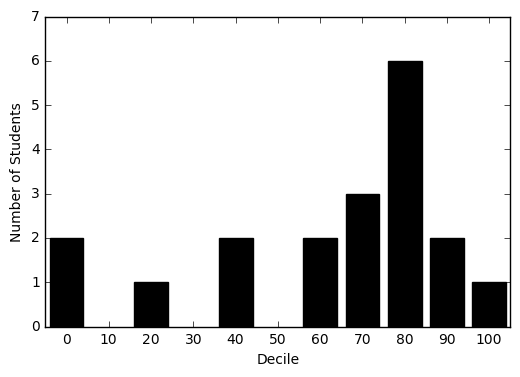
히스토그램
히스토그램이란 정해진 구간에 해당되는 항목의 개수를 보여줌으로써 값의 분포를 관찰할 수 있는 그래프 형태이다.
from collections import Counter

#data
grades = [83,95,91,87,70,85,84,80,82,0,100,67,63,74,77,0,25,47,42]

#decile
decile = lambda grade: grade // 10 * 10

#Count each decile
histogram = Counter(decile(grade) for grade in grades)

"""
Draw a bar chart.
for decile, place bar to the left '4'
label it with values.
thickness of bar is 8 and color is black.
"""

plt.bar([x - 4 for x in histogram.keys()],
       histogram.values(),
       8,
       color='black')

plt.axis([-5, 105, 0, 7])  # xy축 길이
plt.xticks([10 * i for i in range(11)])
plt.ylabel("Number of Students")
plt.xlabel("Decile")
plt.show()
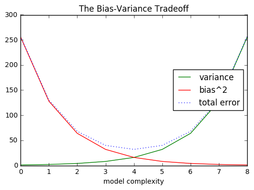
다중 선 그래프
variance = [1,2,4,8,16,32,64,128,256]
bias_squared = [256,128,64,32,16,8,4,2,1]
total_error = [x+y for x,y in zip(variance, bias_squared)]

xs = [i for i, _ in enumerate(variance)]
plt.plot(xs, variance, 'g-', label='variance')
plt.plot(xs, bias_squared, 'r-', label='bias^2')
plt.plot(xs, total_error, 'b:', label='total error')

#각 series에 label을 만들어 줬기 때문에 범례를 나타낼 수 있다.
plt.legend(loc=5)
plt.xlabel("model complexity")
plt.title("The Bias-Variance Tradeoff")
plt.show()
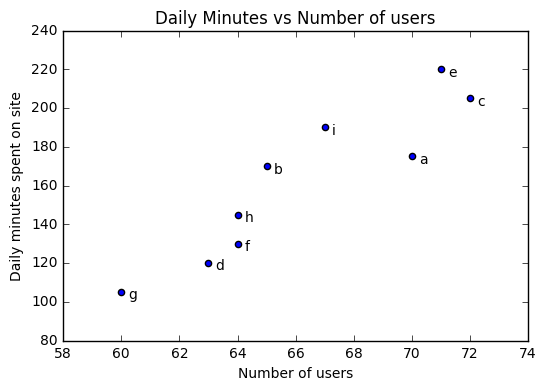
산점도(Scatterplots)
users = [70,65,72,63,71,64,60,64,67]
minutes = [175,170,205,120,220,130,105,145,190]
labels = ['a','b','c','d','e','f','g','h','i']

plt.scatter(users, minutes)
for label, user_count, minute_count in zip(labels, users, minutes):
    plt.annotate(label,
                 xy=(user_count, minute_count),
                 xytext=(5, -5),
                 textcoords="offset points")

plt.title("Daily Minutes vs Number of users")
plt.xlabel("Number of users")
plt.ylabel("Daily minutes spent on site")
plt.show()